
How Razorpay Used Design as a Differentiator
Payments is an interesting domain. When Razorpay launched in 2015, we were told that we are entering an extremely crowded space of payment gateways. And that there's not a lot to solve.
When we looked at this space, somehow all that we found online was just complaints. Nobody was happy with any provider. And online payments were nowhere near as ubiquitous as it is now in 2020. People worried about fraud even when there wasn't much. We would often field questions like "how do I know your software is safe", "why should I trust a one-year-old company with money". All fair questions, to be honest.
5 years since launch, Razorpay now processes $10Bn+ payments volume, $3Bn+ payouts, $2.5Bn+ loans (all annualized) with more than 800k businesses on the platform making it one of the top payment gateways in India.
While a lot of things contributed towards Razorpay's initial growth, some of which included:
- Completely digital onboarding vs physical paperwork with others
- KYC verification and approval in 2-3 days vs weeks with others
- Incredibly simpler integration
It's really easy to understand why these were the differentiators. All of these helped us stand out in a space that people back in 2015 said was "crowded" with too much competition. But one differentiator that people have a difficult time wrapping their head around is design.
Yep, the design has been a major differentiator for Razorpay.
Why does Razorpay need a design team?
One of my roles until 2019 was heading the design team of Razorpay. And one of the most repeated questions that I would get in the early days was:
Why does a payments company like Razorpay need a design team? How much work can even be there? Just outsource it maybe?
People believed that payments is basically APIs and business dashboards for which design doesn't matter. Heck, for most people design meant just the aspect of "how things look".
But for us, design was about how things looked and how things worked. Every single part of our design was done in-house, always. And it became a major differentiator factor for us. The initial core team of 10 at Razorpay when it launched had 2 designers, and it showed.
So our design team handled everything: all product flows, checkout, website, dashboard, brochures, decks, ads etc.
Building Credibility Through Design
With two designers, we couldn't pick every single thing at the same time. So the first set of things fortunate to see design love were the most visible parts of Razorpay: Website and Checkout.
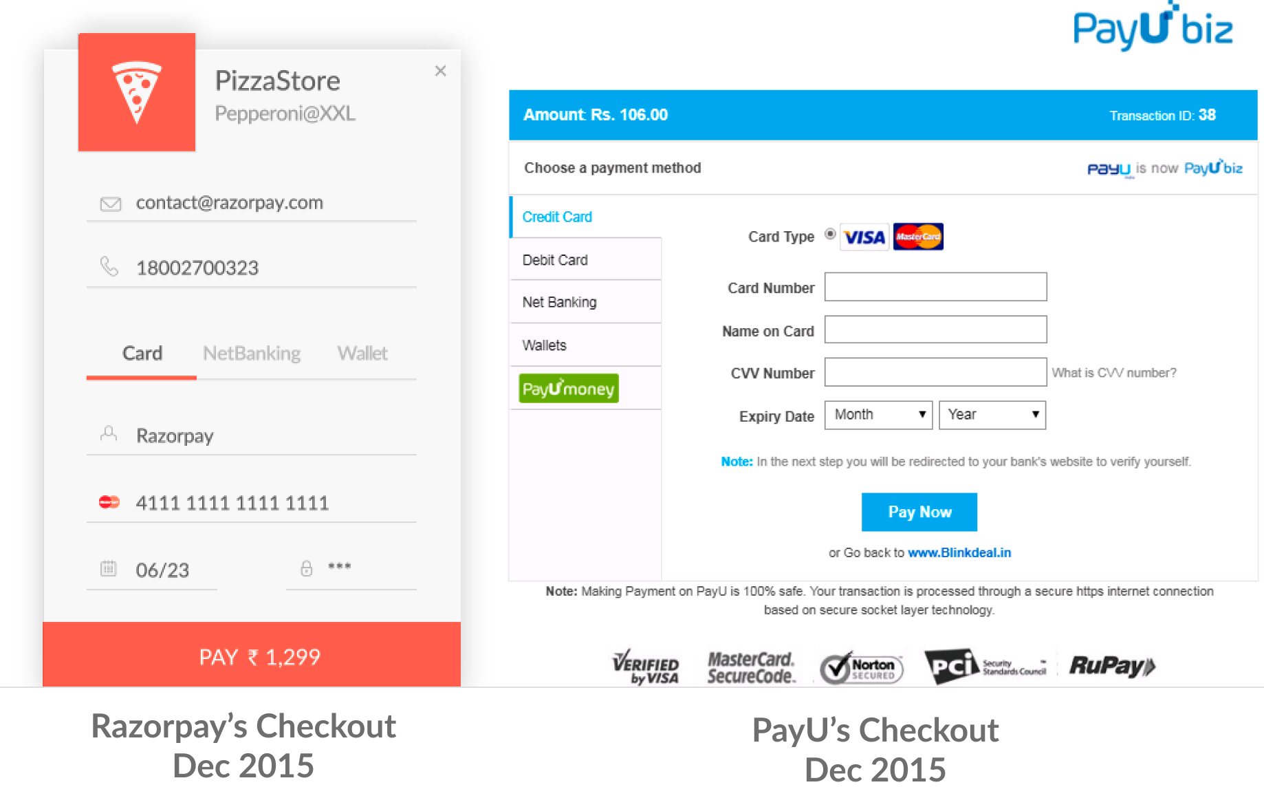
Now again, while these in 2020 look like base requirements, it was totally not the case in 2015, particularly for B2B payment products. Let me show some screenshots from 2015 for Razorpay and one of our larger competitors: PayU.
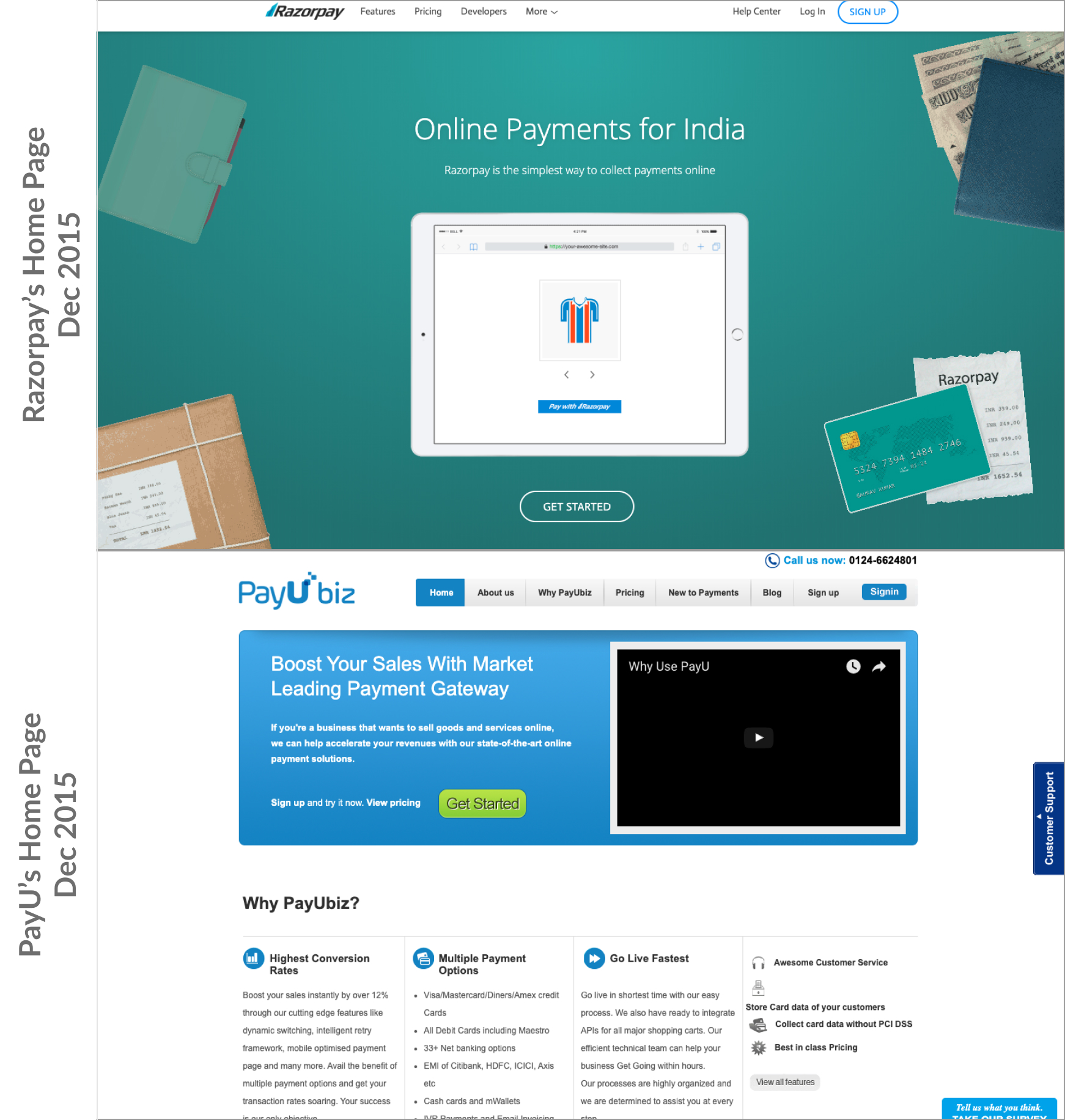
A lot of our competitors have come a long way since then and have understood the importance of design. Their latest designs look much better than their older days.
This comparison is being made to just demonstrate the difference back then, and not to belittle competitors. In fact, I believe having competition is extremely important for the ecosystem and to ensure that we don't get complacent.
There's a stark difference in the design standards. And this was considered unnecessary by the B2B payments industry. But for us this was a way to get entry into the door. For the first 2-3 years, our checkout used to be the very first thing we showed clients, demonstrating the various features that it had like:
- A single "card" tab, no need for debit/credit split
- Auto-advancing of the cursor when you enter 16 digit card number
- A popup based two-factor flow vs a redirect flow etc.
- Dynamic listing of netbanking banks basis performance
- Built-in saved cards requiring zero additional lines of code
All these features along with a design that looked great served towards one goal: To establish that while we were new to the industry, we knew our shit very well, here's the evidence, and there's so much to innovate.
In simpler terms, credibility. That's what it would build.
But this wasn't built through Checkout design only. It was built through a website that befitted a B2C company more than a B2B one, an integration guide that was easy to follow and was not in a word file, and a dashboard that was built with the philosophy that you don't need a sales executive to onboard you.
Success Story
We didn't prioritize design because we had hard facts stating that this would be beneficial for us. In fact, we knew very little. The average work experience in the first 10 employees was around 2 years. We prioritized design because of our beliefs. So we didn't measure this through metrics. We considered this hygiene. But still, there are a few stories that illustrate how making things easy to use helped us.
Let me tell you they story of this startup. They wanted to enable payments in their app. A Product Manager was tasked with figuring out how to embed payments, including deciding things like payments partner. Now she is pretty new to this payment thing. So she looks up different payment gateways online to take a call. She goes through the website, the documentation, the checkout experience and the dashboard itself. One company stood out for her. She signed up, tried out a few things, reviewed with her team and it was decided: Razorpay will be the payments partner for Cure.Fit.
While this story can fit many companies, this is an actual story of a PM working with Cure.fit, a company which was an organic lead for Razorpay. A salesperson didn't chase to close them. When we later spoke with the PM (she ended up joining Razorpay later), this was the story recounted to us.
B2B? B2C? It's all about the customer
B2B software has rarely focussed on design and usability, with the reasoning given that it's not part of the decision making criteria for a business. So it's just a distraction.
I call BS on that.
Whether it's B2B or B2C, at the end of the day, it's a human trying out your product, deciding whether they should use it or not and, finally, if they go ahead then it's humans who are going to be using it.
B2B or not, usability matters, design matters.
We aim for B2C-level usability of our platform, which would translate to a self-serve sign-up flow. This meant making onboarding significantly simpler than how it would be if the primary flow was to have a sales exec assigned to each lead.
This leads to a healthy rate of organic sign-ups without requiring us to have a huge sales team. With more sign-ups, we found that word of mouth marketing started working for use. When someone would ask in Facebook groups which payment gateway they should use for their business, we went from not being mentioned at all to being one of the top mentions very quickly.
As word of mouth marketing kicked in, leading to increased active businesses on our platform, it allowed us to build more products as we had a very high variety of use cases being served by our core payments platform.
And the rest is history.
Our brand and design helped us stand out and it benefitted us in ways we had not planned for when we decided to build a payment gateway in 2015.
State of Design Now
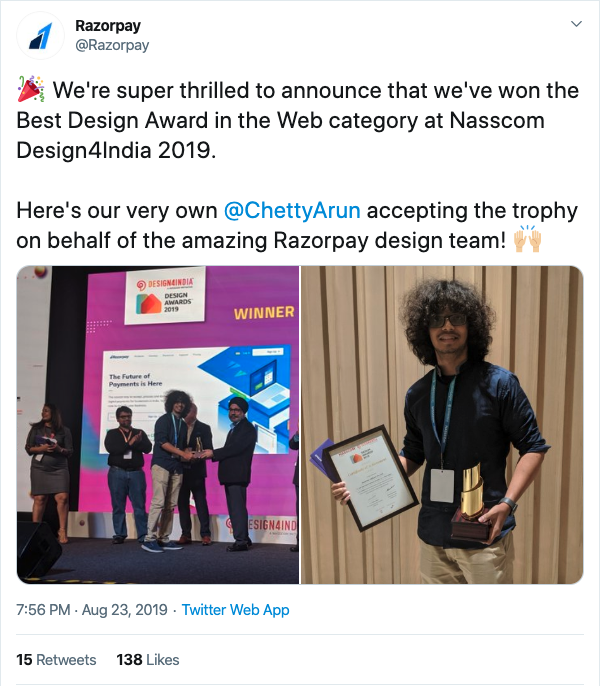
From the initial count of 2, we are now a 23 people strong design team. In the last year, Razorpay's design won the Nasscom Design4India 2019 award.
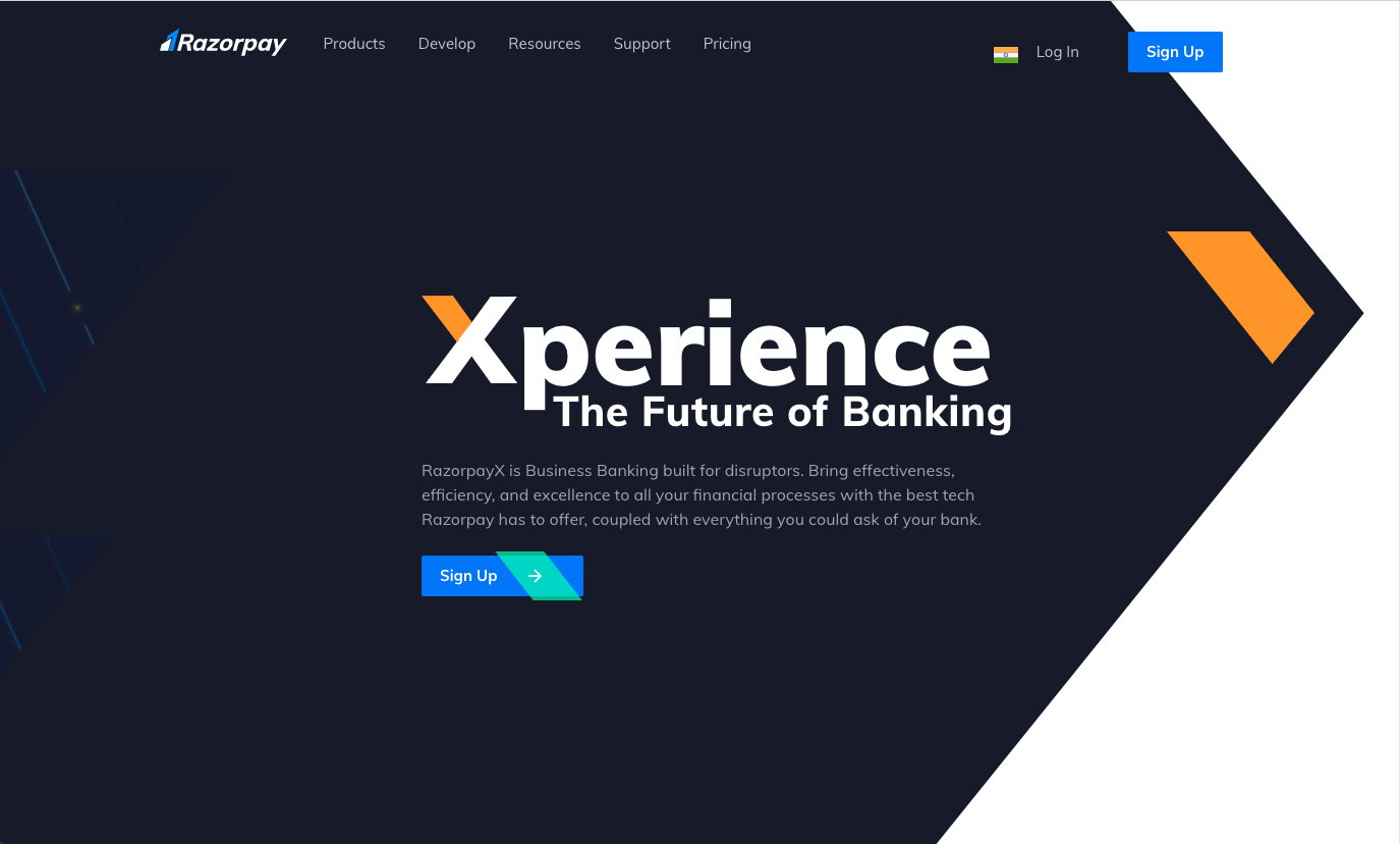
Our website has gone through multiple revamps and is pending another one. This team has created new experiences like RazorpayX as we branch out to Business Banking too.
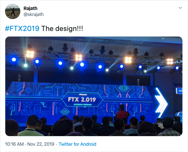
The challenges for this team has itself broadened, as we hosted India's largest fintech conference, FTX, with the entire event design handled in-house. We had attendees calling out the event design on Twitter!
Our product is ever-evolving, as we are barely done with this field! And so is our design. We are looking to further strengthen our design team. Have a look at our careers page and drop us a line if this interests you!
Thanks, @chettyarun, @saurabhsoni_ss for helping with reviewing the draft of this post, and for being the pillars of Razorpay's design team.
And thanks @kshipra_sharma for suggesting a better way to add the images in this post